Dribbble is described as a show and tell for creatives, a place where designers and developers can share small screenshots of what they’re working on. Personally, I’ve found it to be much more. On top of receiving helpful criticisms of work-in-progress, Dribbble has become one of the best online sources for design inspiration.
Not long ago, I regularly browsed online design galleries to aid in finding inspiration when starting a new project. While I occasionally benefited from this kind of research, I realized that I was paying a dangerous amount of attention to momentary trends rather than actual design decisions. Gallery websites offer eye candy and that’s it, no in-depth analysis or critical discussions. Dribbble, on the other hand, encourages helpful feedback for design authors, which in turn teaches other viewers what went right or wrong in a particular design.
However, Dribbble is still young and is not perfect (nor should such be expected of it). For example, I’ve noticed that there are very distinct designer cliques that tend to hog the ball a lot. These designers can post shots of just about anything, even if the quality is mediocre or worse, and still receive praise of the highest sort. This isn’t really a problem with Dribbble though and has more to do with too many designers trying to be water boy for the all-stars.
To help level the playing field, I’ve done a couple things: First, I started checking out more shots from the “everyone” category instead of only those deemed “popular”. You’d be surprised at how many quality pieces go unnoticed because they weren’t fortunate enough to receive hundreds of likes. Secondly, I’ve tried to spread the word about any talented designers I find on Dribbble who I think deserve more recognition than they’re getting.
So, without further ado, here are some of latest favorites:
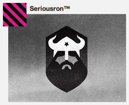
Seriousron has a unique artistic style with excellent use of solid shapes and grunge textures. Brutal Bands design remains one of my favorite shots on Dribbble.
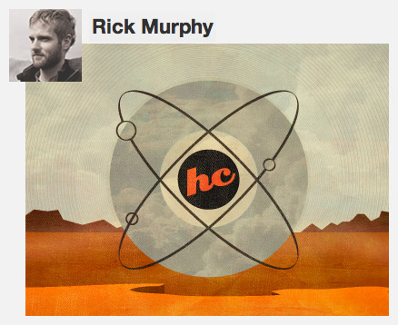
Rick Murphy posts some really cool shots that always remind me of vintage posters. The colors and textures he uses are outstanding.
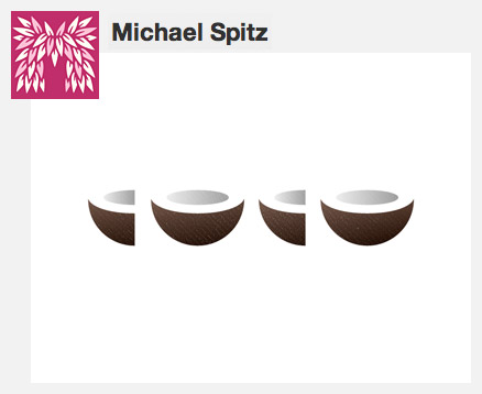
Michael Spitz is, hands down, one of the best logo designers I’ve found on Dribbble. He has an incredible knack for portraying a company’s target message using only what is essential to the design.
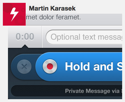
Martin Karasek is one of the more recent Dribbblers I’ve stumbled across and I’m really impressed with his GUI work. Whether it’s icons, an app, or a website, it looks like Martin can handle it all.
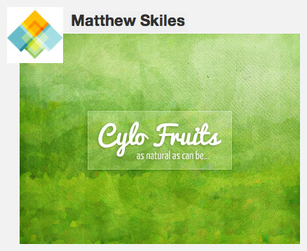
Matthew Skiles continually cranks out very clean designs that are usually different than the normal trends, which is awesome. His most recent shots have featured a beautiful exploration in textures and also icons.
